Monday, 6 October 2014

Term 2_Design that makes a difference.

For this project we had to choose a global problem (hunger, education, pollution) and design a solution to help solve the problem. We then had to choose a design category (visual, product, surface) to design in.

The global problems that I chose were Education and Pollution.

research


I wanted to design a product that is available to anyone and can be used by anyone, not just for the poor or the rich.

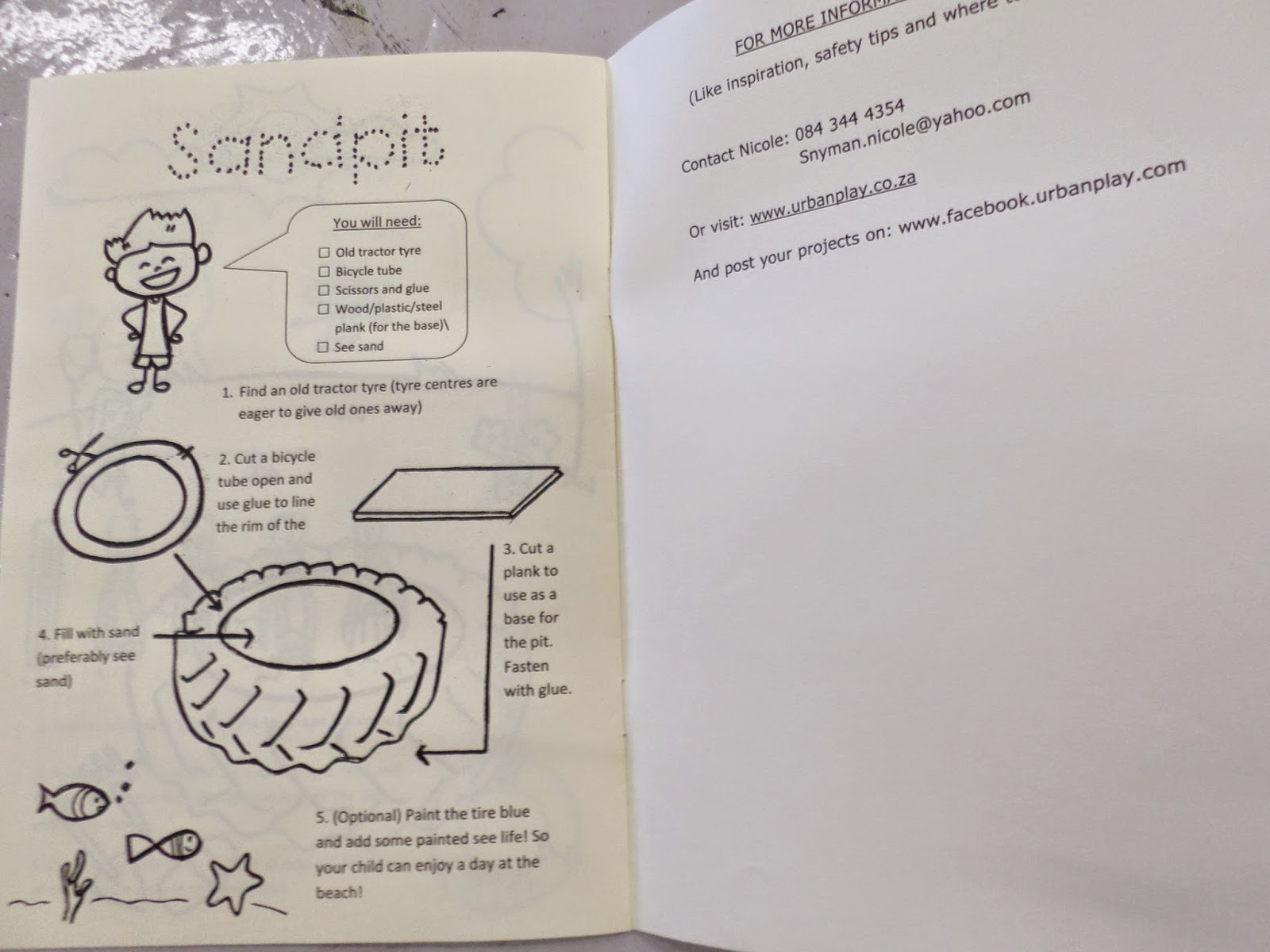
I decided to design an inexpensive booklet that can be bought or handed out. This booklet shows you step by step how to create a playground from easily found recycled materials. By recycling we are stopping pollution, by building your children this playground you teach the younger generation about recycling and playing is a very effective form of education. Thus attempting to make the world a better place by simply having fun. The booklet is designed to be a colouring in book as well, making it ever more fun and educational.

I also designed a logo and the illustrations for the booklet. After that I built the tyre see-saw, following the booklets instructions.

logo design options

I decided on the name Urban Play for the product.

Final Logo
a cool slogan then came to mind:

slogan
THE FINAL PRODUCT:


the booklet


The See-Saw:


Wednesday, 1 October 2014

2015 - Font Design

Our first term project of 2014 was to design a font. We were told to choose an inspiration and experiment with different ways of creating letters. I chose dance as my inspiration because, at least for me, it is one of the most beautiful forms of expression.

I experimented with different poses to best portray the letters. Finally I asked two of my friends to be my models, a gymnast and a ballet dancer.

experimenting phase


planning

THE FINAL PRODUCT:

I called the font: LetHER Dance

LetHER Dance


V
X

Sunday, 3 November 2013

Term 4 - Logo design

The possibility that one of your designs could be painted on your schools graffiti wall was quite a motivator for this project ;)

Just to explain the big picture: our school did a series of discussions about the following character building words:  caring, trustworthy, respectful, citizen, responsible, fair.
For this project we now had to design a logo for one of these words. Our art teachers are now going to choose some of our logos to paint onto our schools new graffiti wall. (To promote character building in a fun way.)
collecting fonts
I just used the word design to experiment with different fonts.


Our teacher then told us what our word is - I got "Respect" and these are some of the symbols that I linked to the word and wanted to add to my logo:


symbols
the clenched fist
if you want you can check out a brief history of the clenched fist and see why this symbol linked well with respect (for ages it has been used as a symbol of defiance against violence) and to me, if you handle a situation without violence, you show respect towards someone.


I then experimented with different font concepts, trying to portray the concepts of respect as clearly as possible. while keeping in mind the elements and principals of design , the gestalt principles and creative triggers.

These were my four final Logo options:


This is my final design :) respect in the form of the clenched fist.

abstract art

Abstract ideas portrayed visually. This project was a short one, but still required a lot of planning, brainstorming, trail&error.

We were given three sounds situations that we had to choose two from to portray visually by using only circles, squares and lines. These elements were printed out for us so we had to cut, arrange and paste them to portray two of these sounds: noise, silence or harmony.


After doing some brainstorming I decided to use all three sounds in such a way that they work together to portray the situations. 

 
These were my three final compositions  the one above is Slience and the situation is "sweet sleep"- the peacefullness of slumbering in. [there is a white page between the above composition and the one below.]
 
This image (above) is Noise & the situation - "Noise and craziness of our everyday life " - busy days, crazy due dates and massive work loads.

[when you then remove the white page between silence an noise, you get.. harmony!] so this is harmony :) the situation is: "my happy place" - the time of day when you just calm down and relax, e.g listening to music.

Saturday, 2 November 2013

industrial design

I was particularly excited for this project! - I’m really interested in industrial design and have been considering it as a career option :D

So firstly we had to choose any industrial object and start documenting it through conceptual and accurate drawings. (I chose a whisk as my object.)

conceptual and accurate drawings

We that had to decide on changes (improvements) we want to make to the object, keeping in mind the elements and principles of design as well as the universal principals of design.


Then we had to re-draw the object with the improvements we made to it.


The first improvement I made was to tie the wires(made from silicone) of the top part of the whisk together. (that way it is more sturdy) then i added the swirl in the middle of the wires. This has a aesthetic as well as functional purpose (the whisking will go faster with the added wire in the middle) the main wires are green and the swirl yellow - complimentary colours.
 
Changes I made to the handle was to add a holding place(for you thumb and pointing finger) lined with rubber. To ensure a sturdy grip. then i added a pallet knife blade at the bottom of the handle.(the most commonly whisked food is eggs, and an egg needs to be broken open before you can whisk it) So its like a two in one product :)
 

Tuesday, 22 October 2013

Term 3 - chair design


This project was quite a challenging one. But then again, what is design without the challenges? The assignment was to build a model chair (using ONLY cardboard, no glue, tape or any other materials) that can fold up and down.
We also had to connect our chair concept to “World Design Capital Cape Town 2014


collecting info & brainstorming
 
This reminded me of this “Seeds Of Truth” project I heard of – an amazing concept of which the purpose is to help people reduce their carbon footprint.
So I decided to take that approach to this project – how can a simple chair have a positive impact on consumers?

brainstorming


My final concept was to build a camping chair that come with seeds that families can plant at each camping site they visit – kind of like a ‘I Was Here’ that you can leave behind, and in the proses also improve the earths well being. The chairs decoration then also supports this concept.


The pipe looking parts slides into the back part of the chair - the back can then also be adjusted. I weaved the seat parts together with paper.
 
and TA DA! a nifty camping chair that will hopefully have an even greater purpose than having a comfy seat when roasting marshmallows.